The Diligence Company
Interactive
The client
The Diligence Company, is a business based in Atlanta, United States, dedicated to the creation and management of projects in the hospitality industry. Their experience is based on luxury projects such as restaurants, bars, entertainment centers, hotels & resorts.
keywords
Management/ Atlanta/ Graphic Design/ UI/ UX/ Branding
the objective
Being able to attain appraisal to the company's services while maintaining consistency with the colors present in the diverse brand applications.
the solution
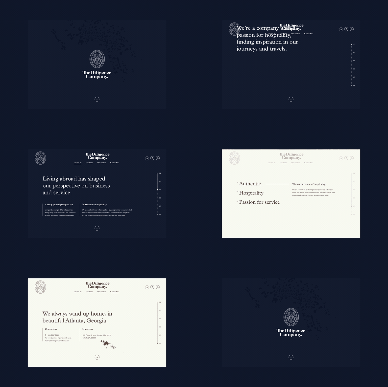
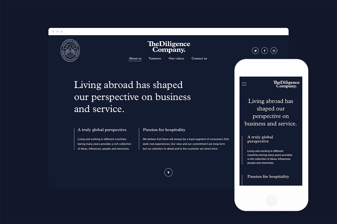
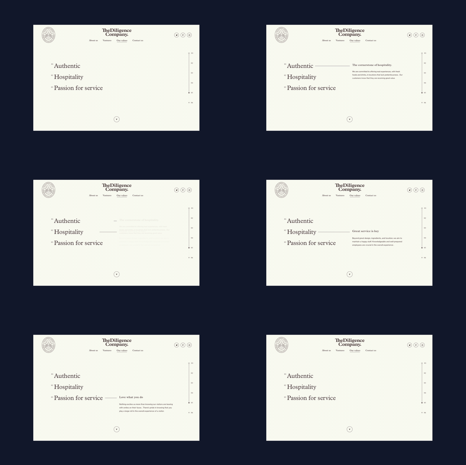
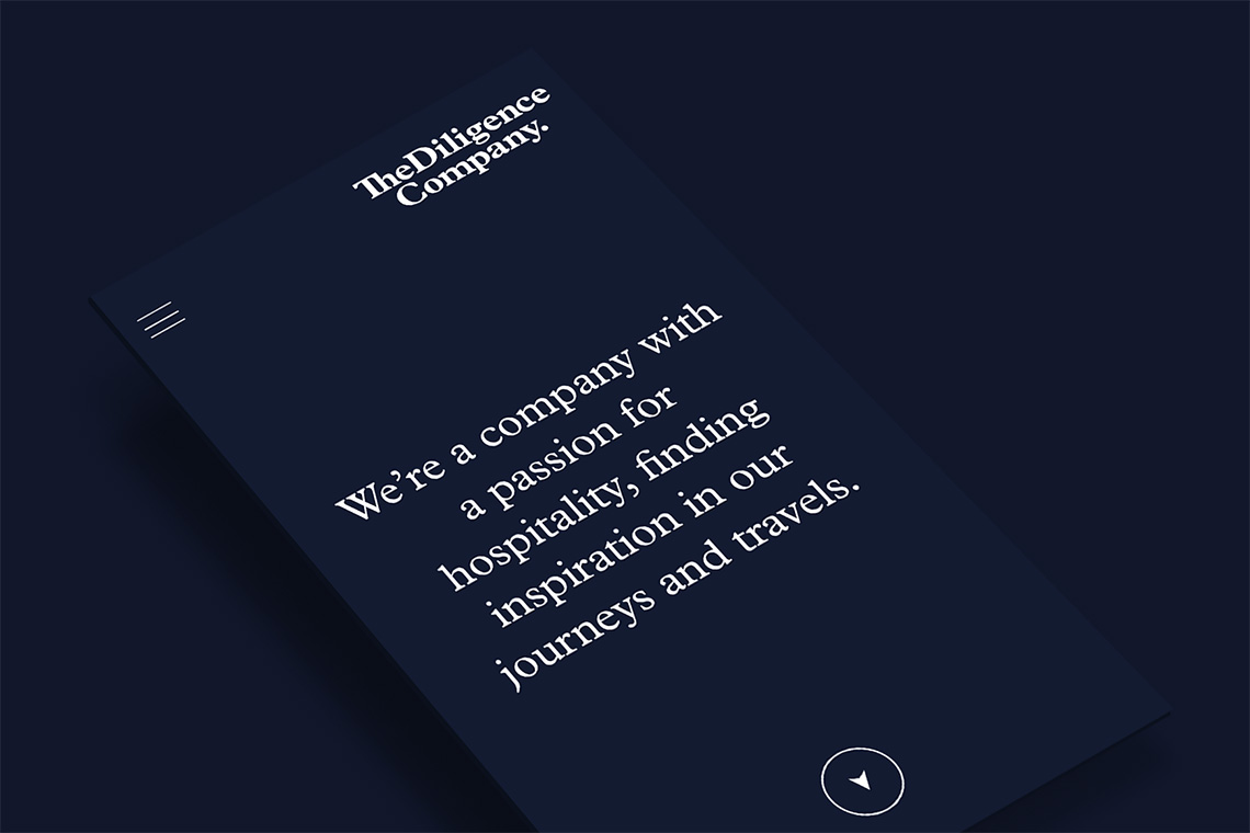
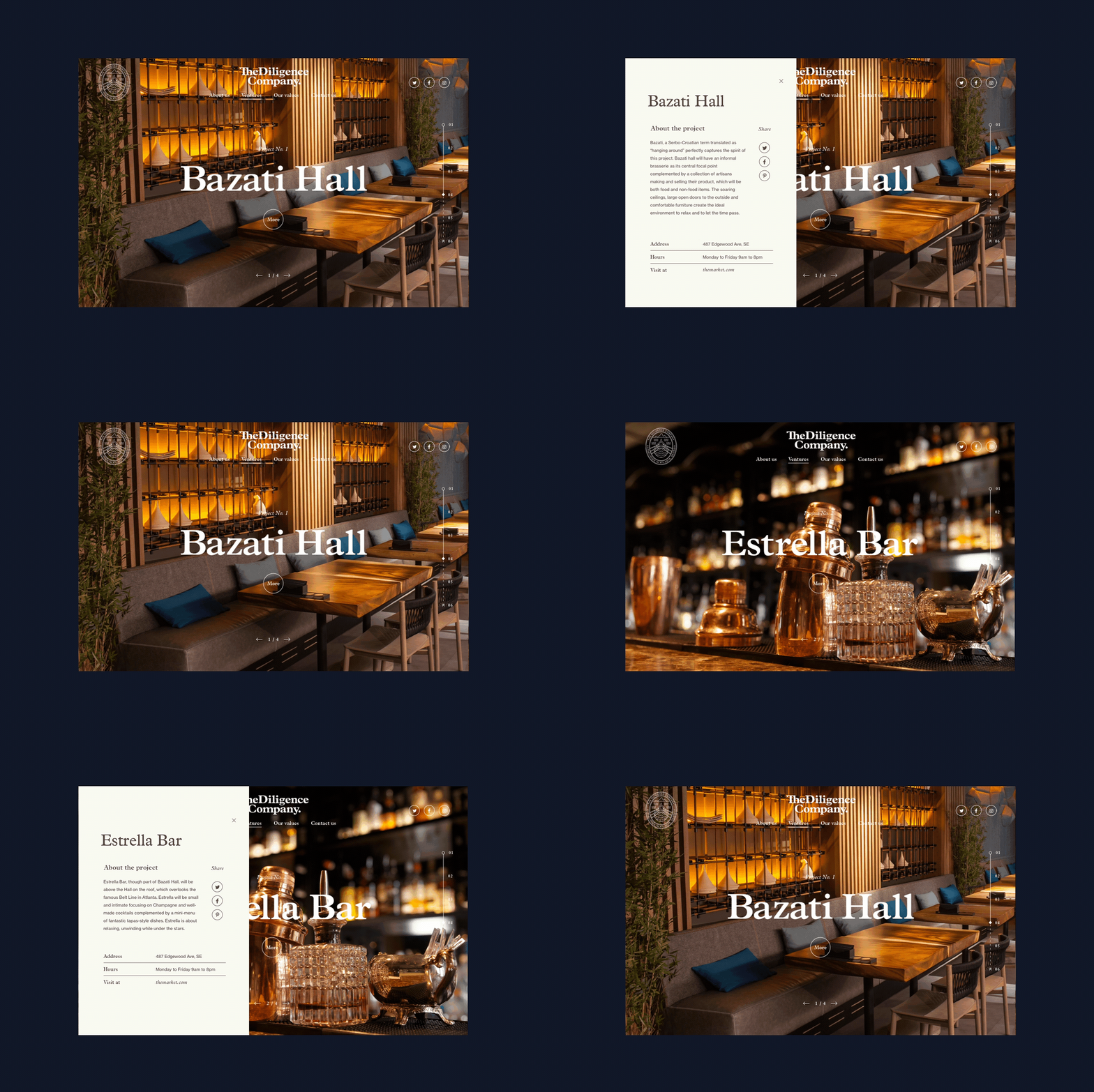
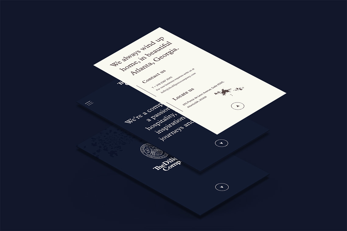
As part of the brand's deployment, we designed and developed a website representing the values, philosophy and brand concepts through a simple but subtly dynamical navigation. We created a memorable experience employing a hierarchical reticle as a base. — (A)
Valores, filosofía y conceptos de la marca a través de una navegación simple y dinámica.
The Diligence Company
BRANDING
the objective
To convey formality and experience, part of the company's personality. And also to conceptually represent the conquest of new opportunities within a team of working together towards a common objective.
the solution
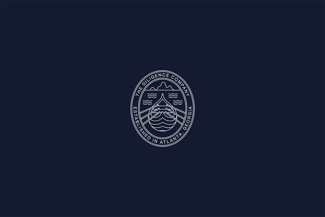
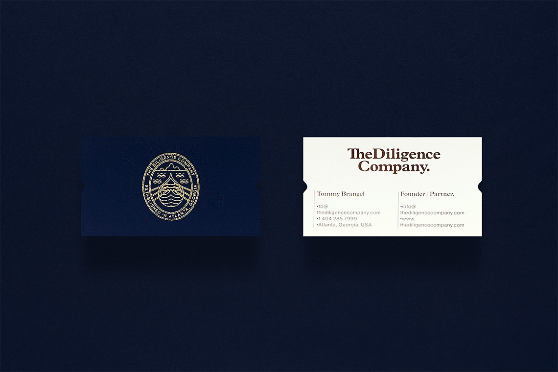
For the brand's creation, we chose as inspiration Leif Erikson's voyages. Erikson was a Norse explorer known for discovering North America before Christopher Columbus. The brand icon, consists of a boat that conceptually represents sailing towards the conquest of new opportunities within a team of explorers working together towards a common objective.
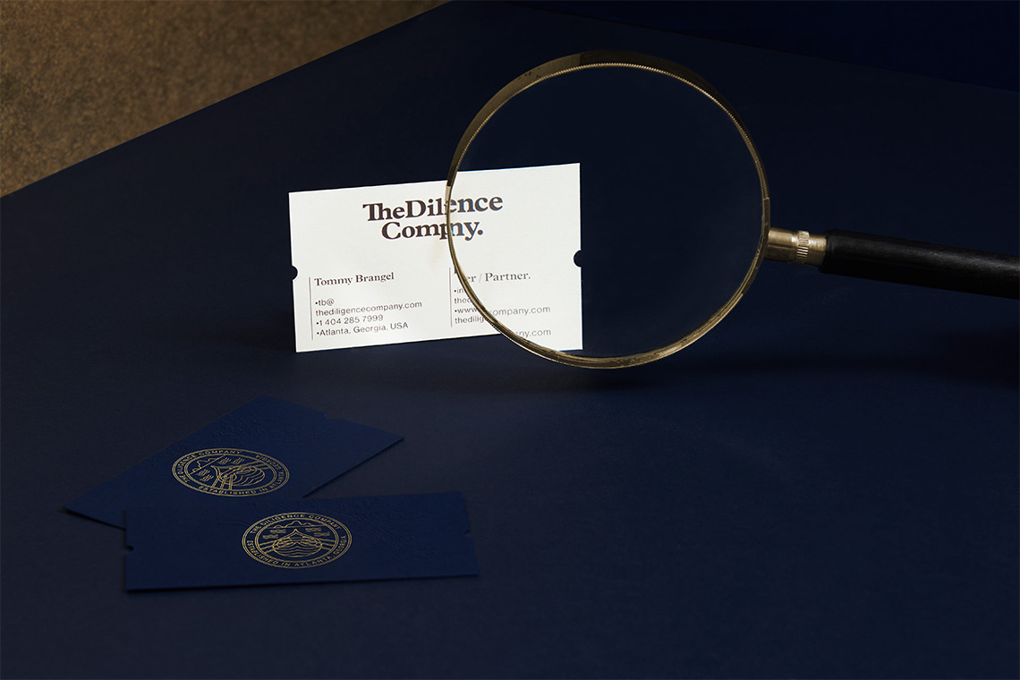
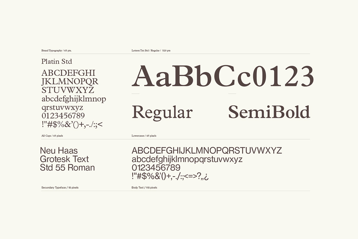
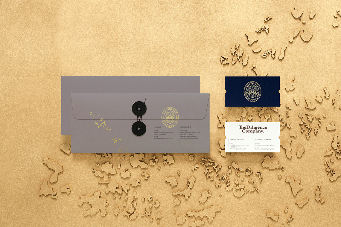
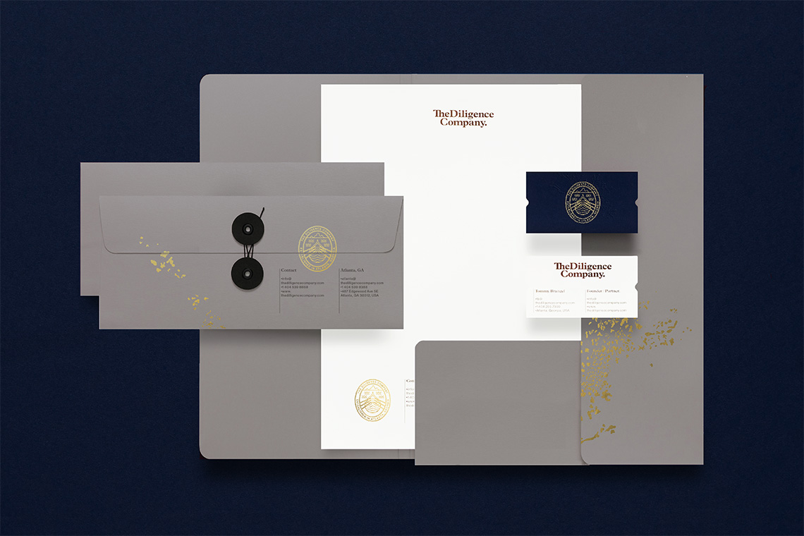
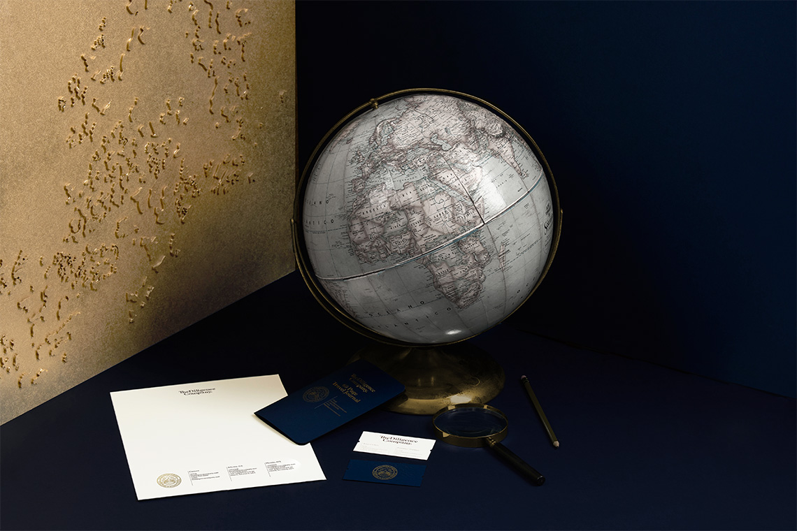
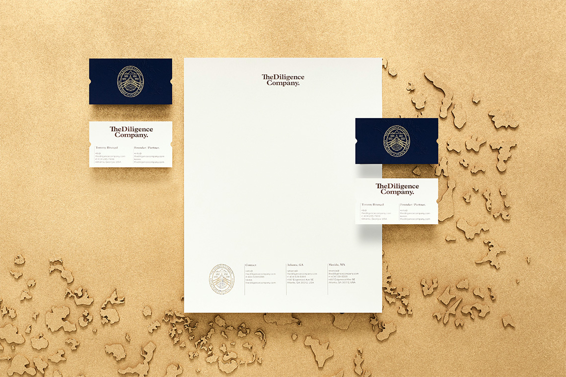
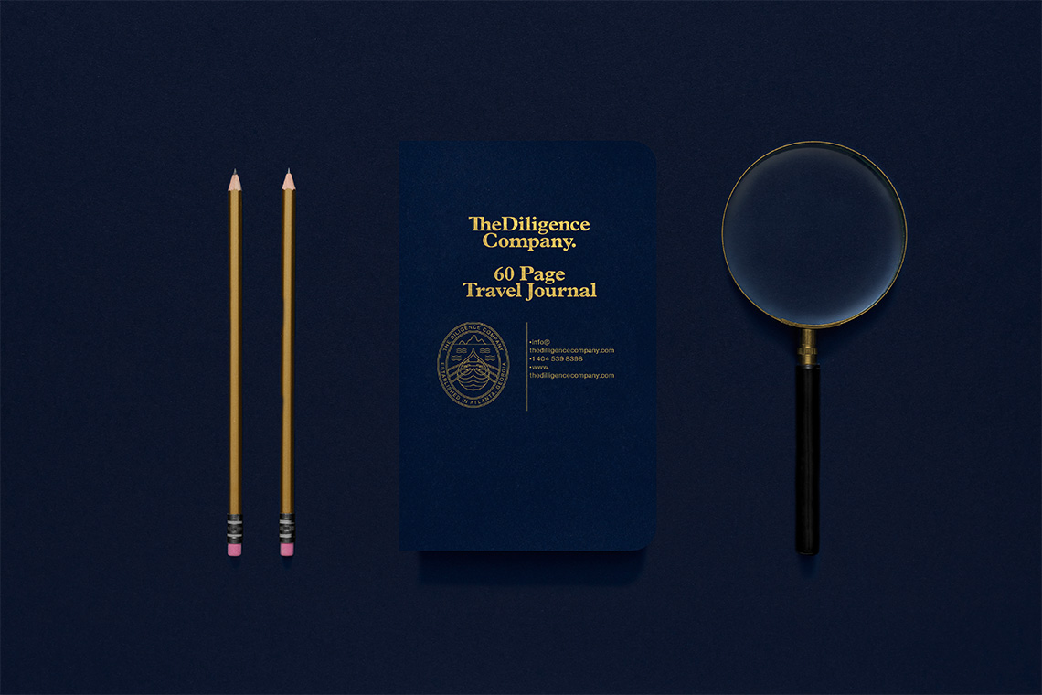
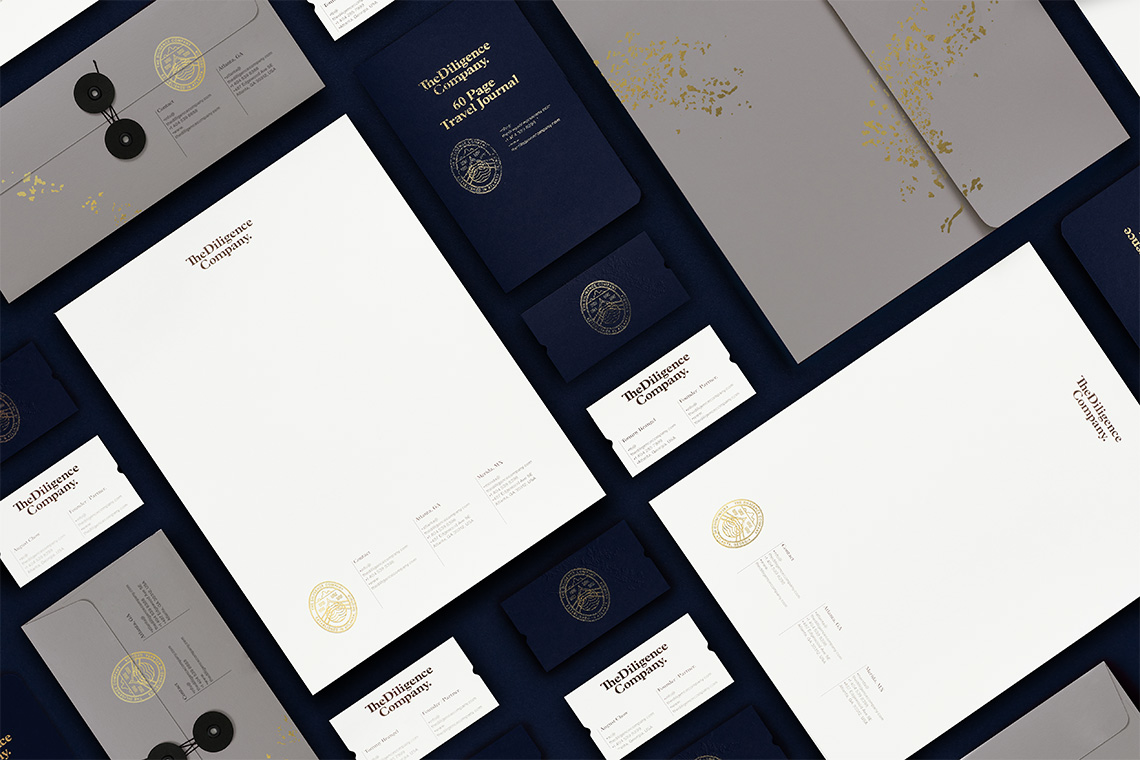
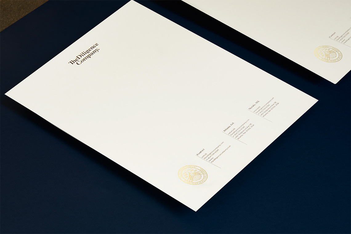
The color palette, leans to the dark blue reminding us of the ocean and its voyages. The usage of blue, at the same time, represents formality and experience, part of the company's personality. The golden touches add the elegance and exclusiveness tones required by the brand. The typographical selection presents contrasts with the usage of the serif Platin and modern touches on behalf of Neue Haas Grotesk.
The brand pattern is based on archipelago aerial views. With these, we were able to compliment the classical grids with a modern setting adding legitimacy to the graphical identity. — (A)
The icon represents sailing inspired by Leif Erikson voyages.
