Sally Beauty
Interactive
The client
Sally Beauty Supply is a brand specialising in beauty with a wide range of skin care, hair and nail products. Sally started as a single store in New Orleans, United States in 1964. Today, it represents the world's largest professional beauty supplies retailer with premier locations. Currently, Sally Beauty owns and operates more than 4,800 stores worldwide including: United States, Canada, Puerto Rico, Colombia, Peru, Japan, Germany, England and Mexico.
keywords
Beauty/ Art direction/ Branding/ Packaging/ Interaction design/ UI/ UX/ Web design / Iconography
the objective
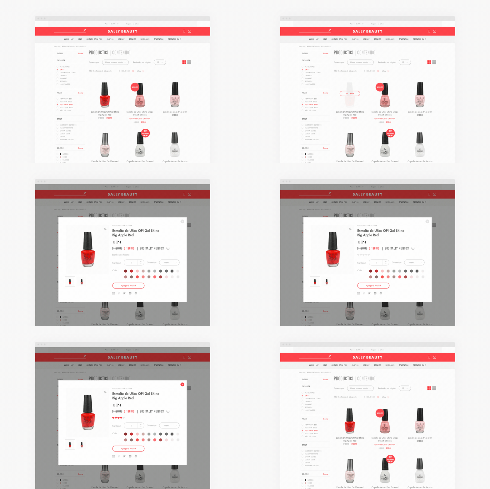
To meet Sally Beauty Mexico expectations with a website focused on a product catalog through an attractive and pragmatics interface for the visitors.
the solution
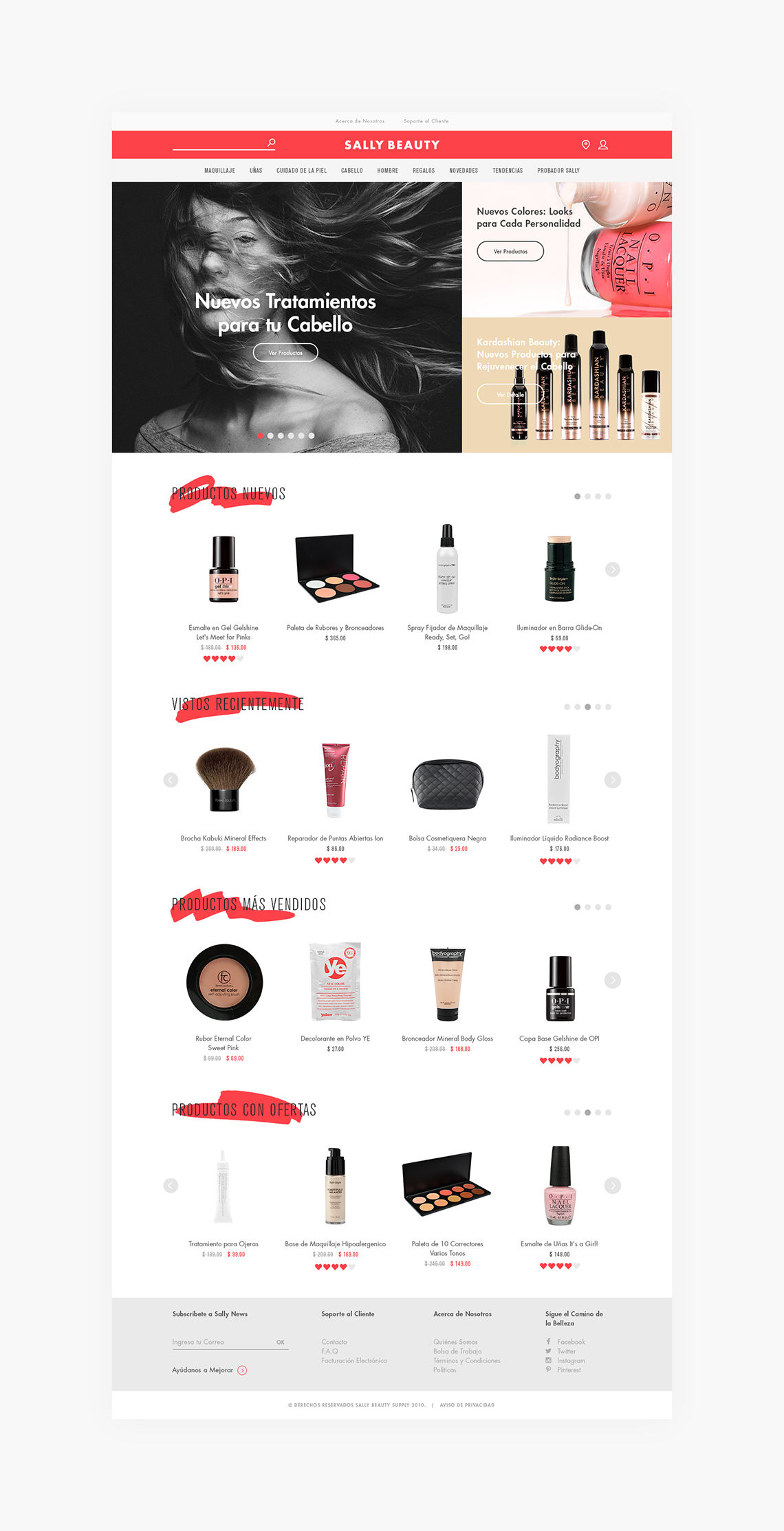
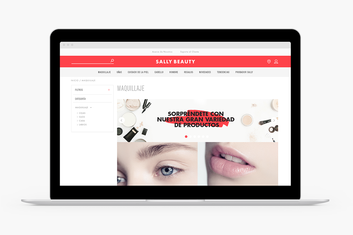
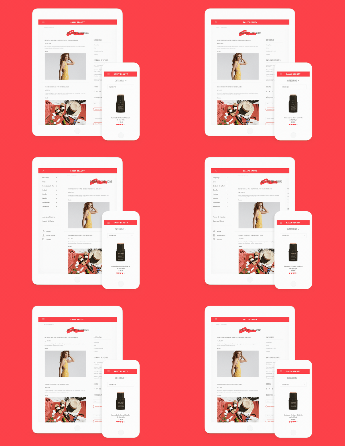
The site redesign covers the brand demands allowing the user to navigate through the platform in a really simple way. From the usability point of view, the user is allowed to discover any product in simple steps.
Anagrama worked closely with the Sally Beauty Supply team and a group of back-end developers to accomplish a friendly and functional experience. — (A)
The user is allowed to discover any product in simple steps.
Sally Beauty
BRANDING
the objective
To introduce a new approach for the brand formalising its graphic communication at a national level.
the solution
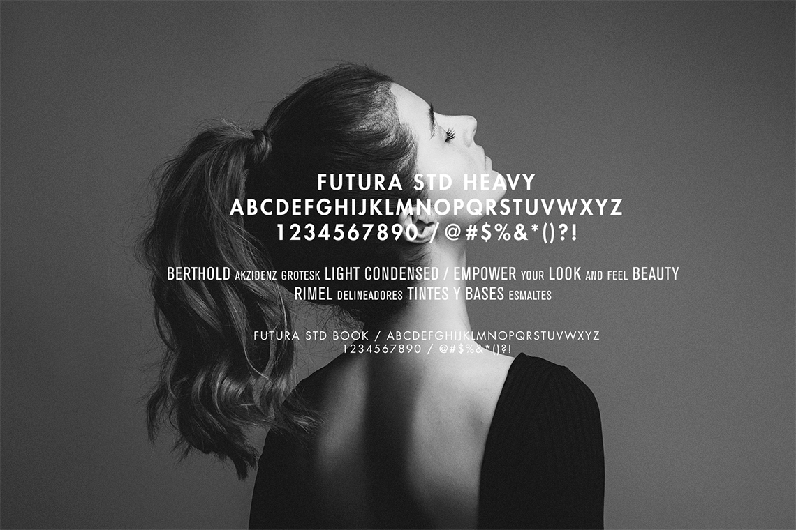
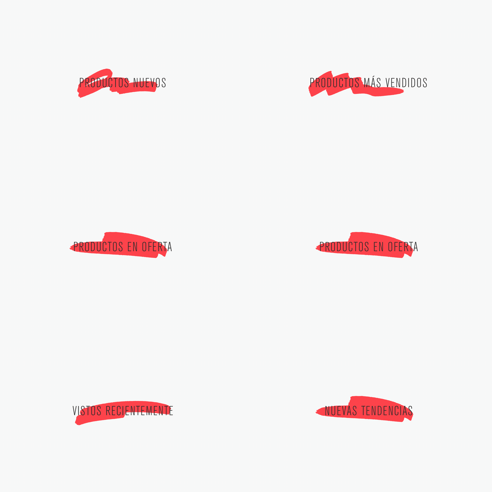
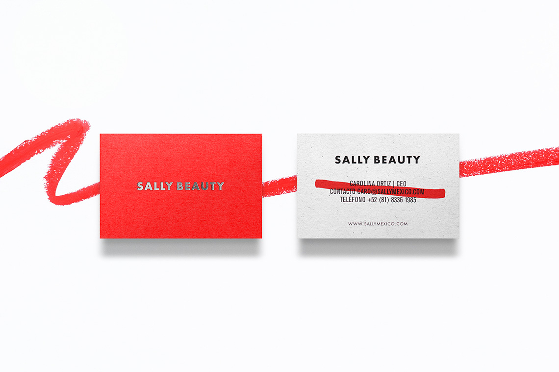
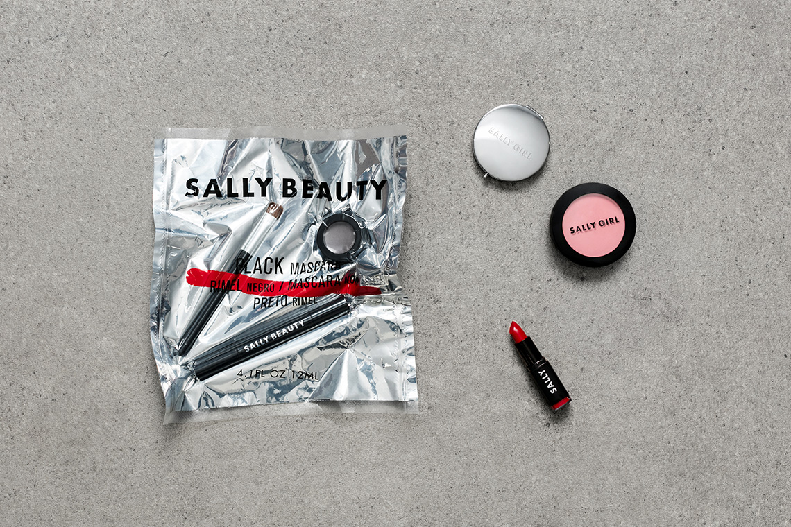
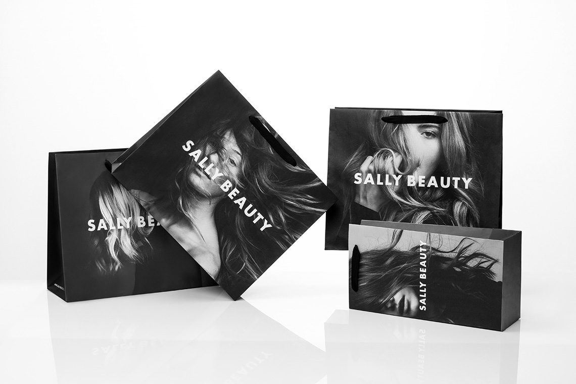
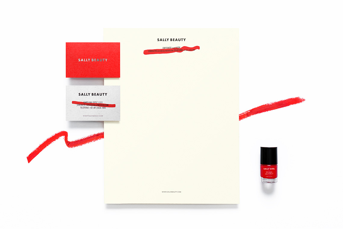
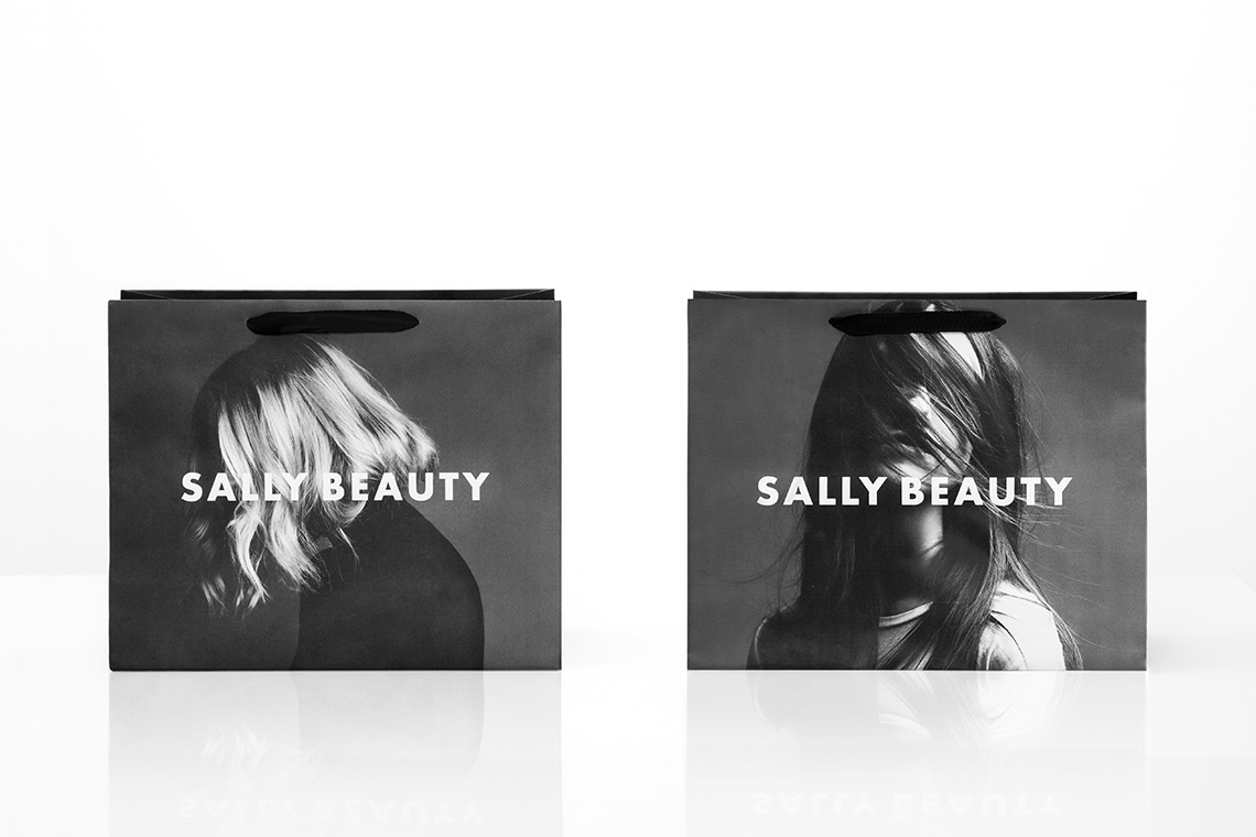
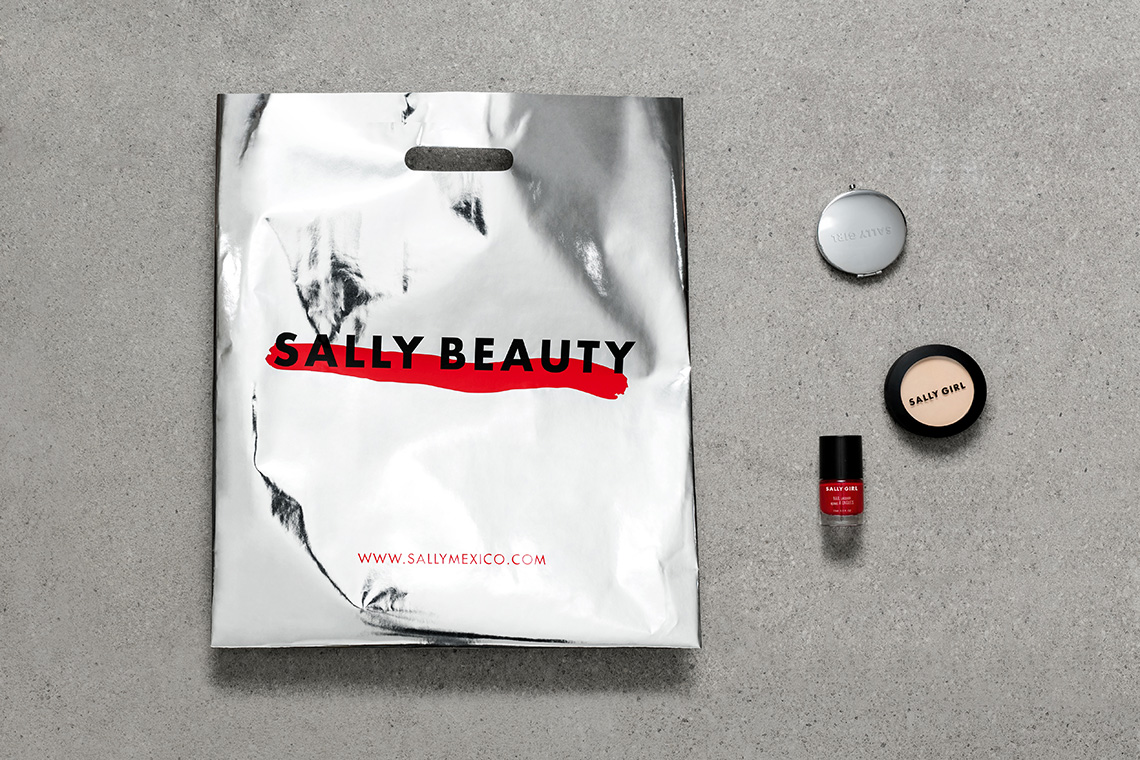
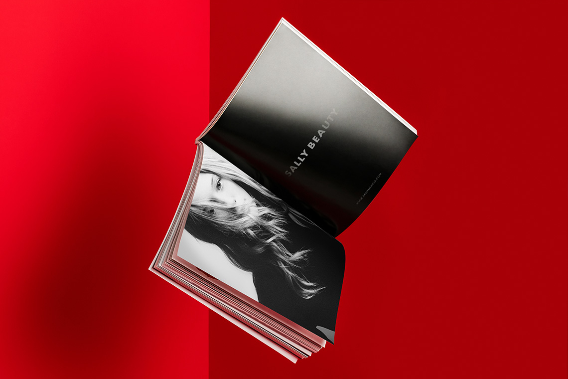
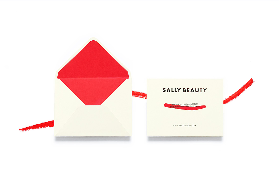
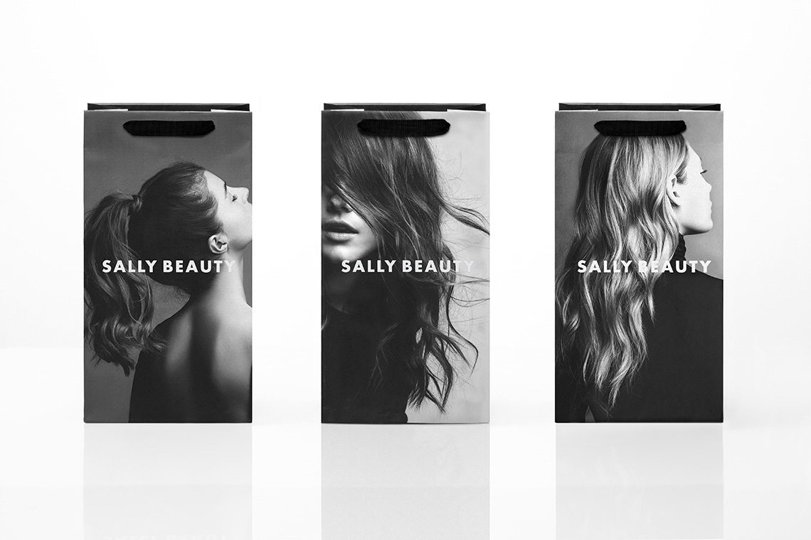
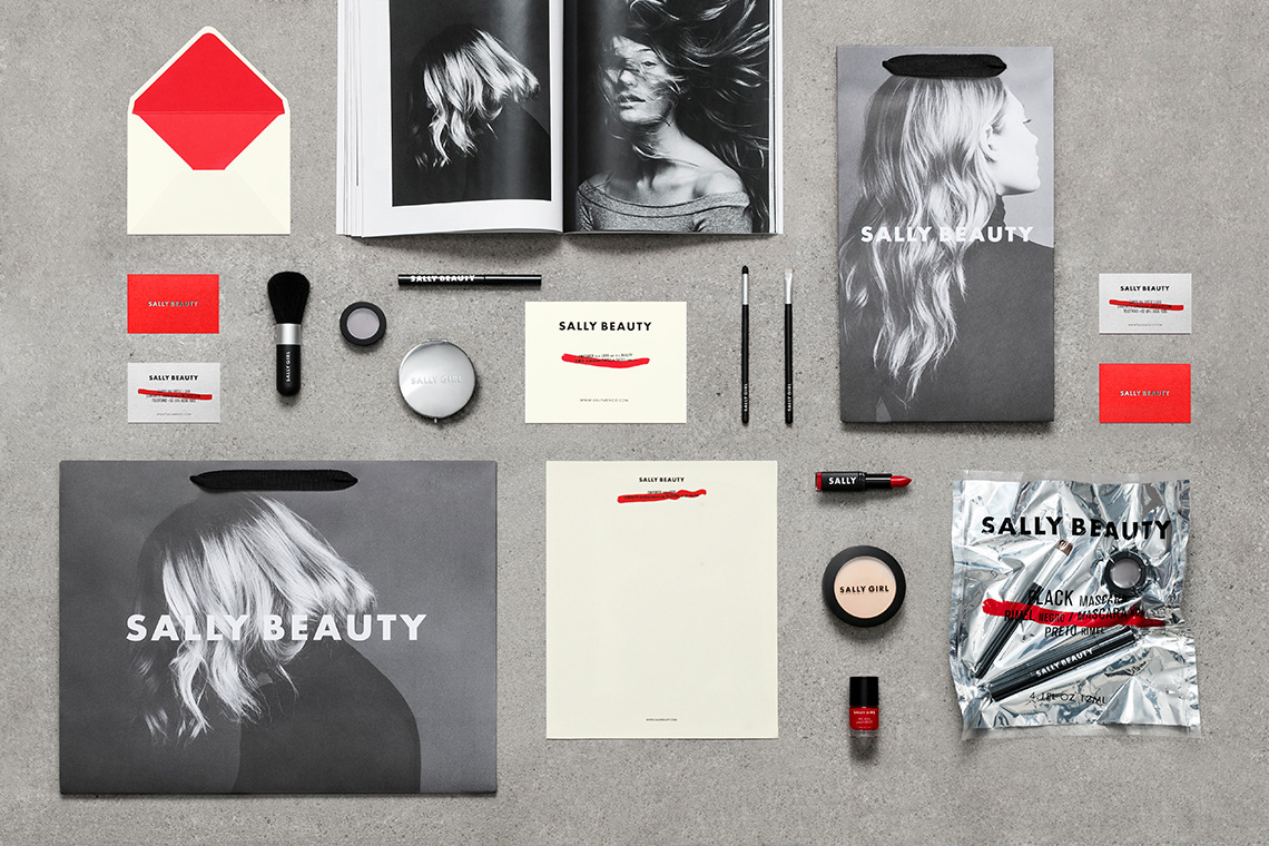
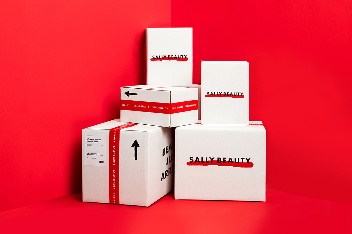
The project evolves the current identity with components based on the existing international branding parameters. Sally Beauty embodies a changing brand responding to seasons and trends. Its "word-mark" communicates neutrality and flexibility. Our engagement results in a timeless brand fitting any style without under-appreciating its uniqueness. We included a series of textures, produced with a lipstick, accompanying typographical arrangements applied to different materials. Condensed typographies appear in a game of hierarchies and sizes reinforcing the casual and fun brand personality. — (A)
We included a series of textures, produced with lipsticks
